CourseWork
Wednesday 3 May 2023
LO: To explore possible tasks and research similar products.
Brief 1 : create a front cover and a double page spread article for health and fitness magazine aimed at a target audience of 14-18 year olds.


Wednesday 10 may 2023
Research
LO: to research codes and conventions of similar products.
Brief 1: create a front cover and a double page spread article for a health and fitness magazine aimed at a audience primarily of 14-18 year olds.


1) they include fitness and health articles on the cover.
2) they use celebrities and fitness instructors and models on the front cover but dont really use any objects and just keep a simple bland background.
3) the colour scheme uses blander and plain colours that normally use more masculine blue colours.
4) the masthead is at the top of the magazine normally placed behind the celebrity or the main focus of the cover and uses serif fonts and basic fonts.
5) they mainly only use one image on the cover to keep the main focus towards the celebrity.
6) they use many cover lines that are normally fitness quotes and inspirational quotes from the celebrity.
7) they use barcodes in mostly the bottom left and right of the magazine to keep it out the way of the main focus and design
8) there are barley any changes to the fonts on the front cover as they will still use simple serif fonts with different sizes used as the quotes are used with a bigger size.
9)puffs are used to attract attention to the inspirational quotes and to the cover lines that describe what will be in the magazines
Double Page Spread


Double page spread questions
1) the double page spreads are laid out to give out as much information as possible while having imagery along side the description to make them grab peoples attention and interest them.
2) the images are used to better describe the text and are also used to interest the reader to that page and give a quick description on what the page might be about.
3) they use different fonts and texts that normally follow the same serif font on the front cover to keep the same contrast through out the whole page but are normally used at a bigger size to give a description about what the page is a bout in a quick short bit of text.
4) the text is organised in a certain way where they use simple but large stanzes if text next to large images to keep the readers attention on one subject until turned to the next page
Magazine analysis
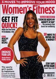
1) in this health and fitness magazine they use simple and plain characteristics on there front cover as they use simple serif fonts with a simple colour pallet they also use a simple image on both the front cover and double page spread as they just use a simple pose from the model in the image with the same bland clothing unlike other fitness magazines where they would have there shirts off and would normally be seen working out.
2) i think the production value of the magazine from health and fitness is in the middle as it does not use low quality paper but doesn't use any glossy or higher quality paper and they can be seen to have any a
english rugby fitness stars in there magazine showing signs of a higher quality magazine.
3) the ideologies presented in the magazine are presented to be more positive and health fitness and overall focussing on improvement of health and diet with almost every image in the magazine being someone working out with a quote of motivation this can be seen through a cover line on the front cover telling us that they have breakfast recipes for better muscle growth.
4) the colour pallet of the front cover and double page spread are quite bland using mostly dark blue and red colouring along with some black and a simple white background which all gives it a more formal and simplistic style and is a lot easier laid out and easier to read for the older and more to the point target audience.
5) the producer of the magazine is seen to present people in the magazine to be more masculine and almost like fitness freaks like that there whole life revolves around fitness and health people in the magazine are also represented to be seen out in nature with a lot of green or in a gym with a lot of darker blues and whites.
6) the target audience of the magazine are 21-40 year old men and the magazine is seen to appeal to this age range through its almost bland colour way leaving it very simplistic and to the point while also giving them tips to live a better and healthy life style.
7) you can tell that the front cover and double page spread are from the same magazine as they are both seen to use the same simplistic colour pallet and are laid out the same in a simplistic and straight to the point way to reach the target audience desired and you can tell ther from the same thing as they continue to quote and push a point that having a better diet and healthier lifestyle will greatly improve your life for the better.
magazine analysis 2
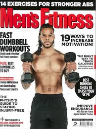
1) the characteristics of this mens health magazine is still gives a masculine effect through there use of more blue and black colours as they use a more simple masculine colour pallet but what differs them from other brands that instead of using a fitness star they have used an actor (Paul Rudd) which he is not know for his fitness but much more for his acting instead.
2) i think the production value of this magazine is higher qualities as it has a lot more smoother and higher qualities paper while also having expensive brands and companies adverts through out there double page spreads while also having Paul Rudd who is a world round know actor of who would most likely not work with a smaller insignificant magazine company.
3) the ideologies in this magazine presented by the producer are used to give people a reason to better there life style through health and fitness and how it will vastly improve on there life style this can all be seen through both the front cover through the use of cover lines telling us that routing is a human need and that it is what can make your life grow for the better through routine and health and fitness.
4) the colour pallet used by the producers of the magazine through out the front cover and double page spread all through the magazine as they use a simple boring colour pallet of blue black and the tiniest bit of yellow to highlight important quotes and sayings the use of this colour pallet may be representing what they mean by that routine is a human need as they use the colours stay loyal through out the whole magazine.
5) people and mainly Paul Rudd are presented as following a routine through out the magazine and are represented to live a full enjoyable and full filling life while also being fit and healthy and are almost seen to be represented as they have completed life and are kind of represented as perfect.
6) the target audience trying to be reached by the producers of the magazine are 25- 34 year olds with the majority of them being male this is trying to be reached by the company by there use of the actor Paul Rudd and how the target audience would have grown up with and seen him as an idol and seen his development through life and see that they may also be able to do the same the mostly male audience may be attracted to the more masculine colour pallet and the simplistic lay out and how easy it is to read and how it gets straight to the point.
7) you can tell that the front cover and double page spreads through out the magazine are both from the same magazine as through out the magazine they all use on all pages the same simplistic masculine colour pallet and the use of images and photos of Paul Rudd exercising on almost every single double page spread and front cover and how the all push on to the audience to improve there life and how that following a routine will be able to help them improve there life.
Codes and Conventions for the front cover of a magazine
. a simplistic colour pallet of mostly blue and black but may have some red or yellow.
. blocky and serif typography for the masthead and cover lines.
. fitness and health tips on the cover lines on how to improve your life through fitness and health.
. a main image of a man wearing a simple bland clothing that normally matches the colour pallet.
. they normally include some quotes form the celebrity or fitness star on the main image/ front cover.
Codes and Conventions for the double page spread of a magazine
. also a simplistic colour pallet of blue and black that follows the front cover colour pallet.
. they use a simply laid out and very organised text and images that are used to get straight to the point .
. they also include qoutes from the celebrity or fitness star on almost every single page while also including a main image that is on mostly every double page spread that is also filled with text and context.
.
Wednesday 28 June 2023
Target audience
LO: to research our target audience to enable successful targeting.
target audience 14-18 year olds
cover 1
. it will have an older target audience maybe 25-40 year olds.
. will have a more sophisticated and rich target audience.
. it will target more successful men.
. may target males with interest in technology and building a business.
. it may target more people driven to get more money and make newer technology.
cover 2
. i think the target audience will be a range of 20-30 year old women
. it would be targeted at women that may want to look better.
. there is more female interest shown will the cover lines about beauty fixes and relationship.
cover 3
. i think it targets around 30-50 males.
. and also targets people who have interest in movies
. the cover is made to look like graffiti targeting a younger audience.
My target audience
my target audience will be aimed towards male teenagers that include all types aspirers, succeeders and strugglers that want a cheaper way to get healthier and maybe find it easier to keep working on there health and fitness and still need improvements on there fitness and how to make them selves better. while also targeting for strugglers who cant grasp what they want to do to be more active and healthier like weather they want to start at the gym or find a sport to play to also keep fitness and health fun and also interest aspirers who want to start to gain a certain build instead of finding a fun sport more wanting to go to the gym and learn health and fitness tips to gain more muscle and a better diet to get bigger and have a more materialistic build than an actual healthier lifestyle that will help them with self-confidence.


Magazine palening
1) name: free fitness
2) tagline: free fun fitness
3) colour pallet: red and white colours that will blend well together
4) cover image idea: my cover image could include someone playing football or someone performing some sort of exercise of them simple holding a football.
5) cover lines: one of my cover lines may include a quote from a fitness star or some sports player about how to keep motivated to keep going with fitness. another cover line could have some sort of deal for a gym or sports membership at a local gym. also a cover line could include
6) info to include: a barcode and most likely the price of the magazine and the date it was released.
7) double page spread article subject: will be on how to keep a healthy diet for your desired reason weather to get big or to just simply be healthy and also will be about how to maintain having fun in a sport and how to keep motivated.
8) double page spread image ideas: i could have an image of someone mid way through kicking a football or hitting a cricket ball. i could also use an image with a chart of all the healthy foods for a desired diet of what has the most protein, carbs, salts etc.
9) representation: people in my product will be shown to enjoy the sport they are seen playing in the image while also having a serious mind set to achieve there goal and have great motivation and how that can be taught to the viewers.
10) how will it appeal to the target audience: i will make it appeal to my target audience by showing progress change in people who have followed a fitness plan and how through hard work and consistency will have an outcome while also showing a variety of sports and how to get better through training anf having a healthy but also good tasting diet


Wednesday 5 July 2023
In-Design
LO: to explore and understand how to use inDesign for magazine layouts

Wednesday 12 June 2023


Wednesday 19 July 2023
Statement of intent

Wednesday 13 September 2023
Coursework ReviewLO: to recap brief criteria and to explore how to create effective representation.

- my cover is going to follow the layout conventions by using one main image of someone doing combat sports (mixed martial arts) i will use this and the cover lines to spread the awareness of how combat sports can help with stress and anxiety and how it is seen as a stereotypically sport for violent people that take there anger out on other people but i will show the reality of the sport and how it has saved many peoples life for turning for the worst
- my DPS will follow the codes and conventions of a DPS as i will have 3 or 4 other images of someone training in mma
- The genre of my magazine will follow the codes and conventions by keeping the same blue, white and red colour scheme and keep to the same typography through out the DPS and main cover so it will keep it clean and easy to read. while also keeping the theme of fun fitness and easy cheap food to make your life healthier through out the front page and DPS.
- plan a photoshoot
- take photos
- create masthead
- write cover lines
- write article
- layout magazine
Cover Lines
1) Premium Protein-Packed Meals Made For Fitness.
2) 


=

Wednesday 1 November 2023
1) you have articles about healthy eating.
2) you have articles about easy workouts to build muscle.
3) you may have an article about the best gym clothing.
4) you would have articles about a interview of a fitness influencer.
5) you could have reviews on food ( protein shakes) or gym reviews.
Article Writing
LO: to create a convincing article for a teen health and fitness magazine/website using appropriate language, tone and representation.
DPS
1) Headline
2) Cover lines
3) Main image
4) columns
5)
1) i will have 4 images on my DPS that will link to the easy 5 minute fitness workouts on my front page.
2) the article will be about easy 5 minute cardio workouts and stretching warm ups.
3) the images are going to be of someone doing a workout in a small area that will be more informal
4) it will have instructions on how to do something.
5) the numbers on my DPS will be 4 and 5
6) i will use the same font style as my front cover to keep its clean organised layout.
7) the magazine name will be on the pages but in a very subtle area.
8) the sub headings on the DPS will be the name of a quick fitness or warm up routine.
9) i want the people in it to be represented as health and fit while also looking like they know what their doing.
Double Page Spread
Headline ideas
- Free 5 Minute Workouts
- Trainers Typical Training Tips
- Free Weights and plates
Subheading ideas
- Step one
- Step two
- Step three
- Step four
- Finalise
Stand first
Meet the expert Alessandro Roctus that will be helping you through your journey to finalise and see the results you have been waiting to acheieve.


RESEARCH:
ReplyDeleteExcellent, detailed research & analysis - well done!
TA PROFILE:
good
PLANNING:
A good start - I like the masthead
I'd like to see more about how you're going to target teens specifically.